I feel like Anastasia Beverly Hills dropped the Subculture palette like it was hot. And they dropped this palette…. like it was a secret.
Disclaimer: I have only swatched and used the Prism palette, and none of the other ABH palette’s mentioned in this post. Also, this post is very long so if you’re more interested in the swatches than the history please search for (Ctrl + F) ” Swatches of Prism “ to skip the discussion of the drama.
History behind the drama
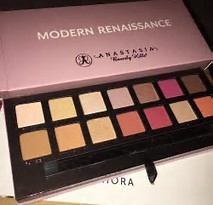
For those of you who are not familiar, Anatasia Beverly Hills released their best selling Modern Renaissance palette last summer (2016) and it looked something like this:
It became popular staple in the everyday make up routines of many bloggers, and youtubers. The shadows were known for being ULTRA pigment, and slightly powdery… but 95% of the review of this palette were absolutely positive.
Almost a year later, ABH releases a “sister palette” in the Summer of 2017 and internet went insane with hype for an eyeshadow formula that was well known and beloved.

This palette is known as the infamous Subculture palette. The Subculture was a palette meant to be edgy, away from mainstream…. and it was a GORGEOUS array of unique shades. If you were sick of every company coming out with a warm, neutral colored palette this was revolutionary. I wanted a camo green like destiny fluffed into my crease, a deep naxy like axis, in the outer edge….. and a mustard yellow like edge, to make a bumble bee cut crease. Looking at this palette made me feel creative… and I was about to treat myself until the HUNDREDS of negative reviews surfaced on the formula.
Long story short it was criticized for being too powdery, some people claiming they can hit the pan if you swirl your brush in…. other’s saying that the powderiness would be bareable, but the shades blended poorly. The maker’s went from investigating if there was a pressing issue in the lab, to quickly saying that it was a pro palette that was being used incorrectly.
I was still considering getting the palette, but there were rumors and hopes of a reformulation, so I decided to wait…. But a few MONTHS later…. this baby was born.

This is my new baby, the Prism Palette. And I know what you’re thinking… the colors are very similar to the Subculture Palette, and that’s why I got it.
So the timeline goes…
Modern Renaissance Palette
(with awesome reviews)
…..
…. 1 year later ….
Subculture Palette
(TERRIBLE reviews, owners claiming that issues are due to user error)
….
…. 3 months later ….
Prism Palette
(A palette with similar shades, with different finishes than the subculture)
I mean… I’m not a marketing major but it seems like this is either an apology palette (because ABH never apologized for the apparently terrible formula of the Subculture palette… also I never purchased it so who knows) or the whole idea was some kind of marketing ploy… which kinda worked on me because I ended up buying it. The latter seems less likely because #1, this was not a highly hyped up or marketed palette, and #2, ABH lost a lot of money in returns of the subculture palette.
ANYWAYS. Let’s just straight into this review. If you want arm swatches, eye swatches, and a review of these shades…. stay tuned… Let’s play!
Swatches of Prism
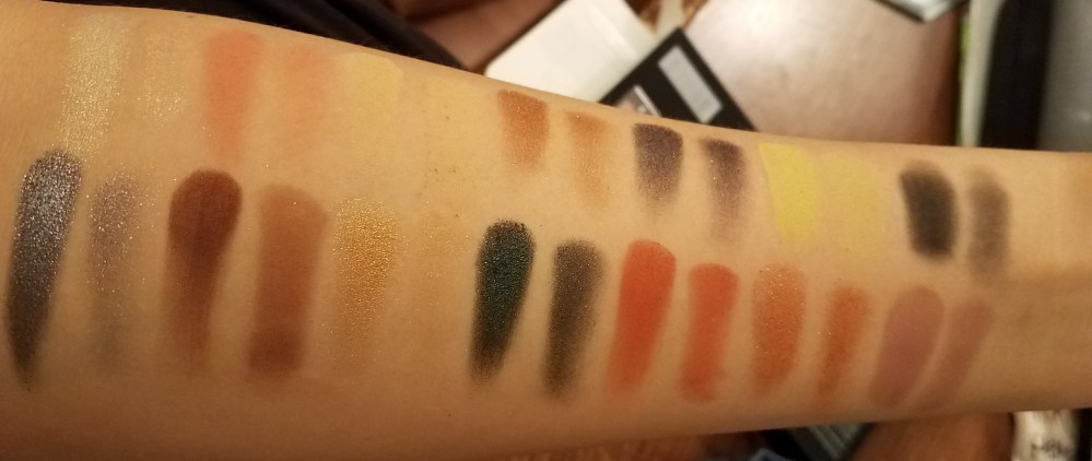
Let’s get into how the individual shadows look on the brush, and on the eyes.
(For all of the shimmer shades I used my finger all over the lid, and under the brow bone I placed the shade with a brush. )
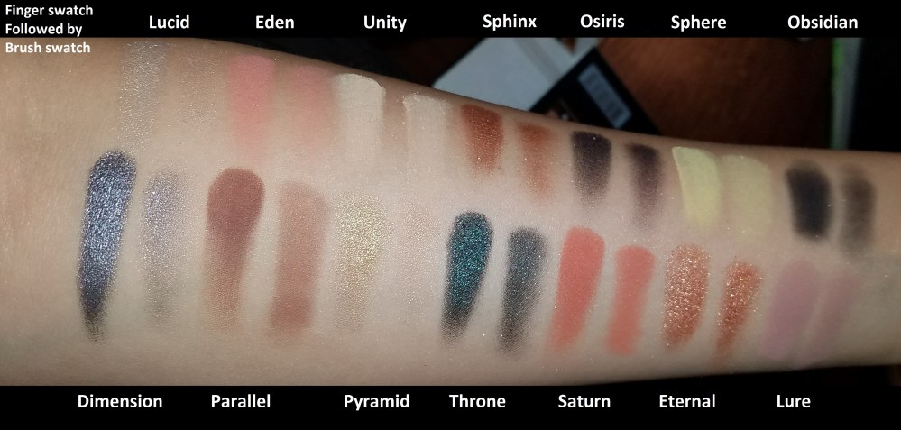
Lucid. Grade: C+

Lucid is a beautiful diamond shimmer shade. Classic inner corner highlight shade. You’ll notice that a lot of these shimmer don’t pick up well on a brush, but that’s fairly typical for me. Lucid was a little harder to pick up on the brush even for a shimmer… so I give it a C+.
Eden. Grade: B+

Unity. Grade: B+
Sphinx. Grade: B

Osiris. Grade: C+
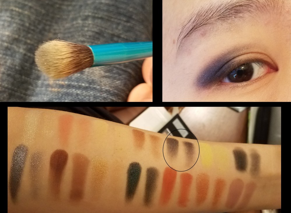
Sphere. Grade: B

Obsidian. Grade: D+
Dimension. Grade: B+

Parallel. Grade: B+

Pyramid. Grade: C+

Throne. Grade: B+

Saturn. Grade: A

Eternal. Grade: A-

Lure. Grade: A-

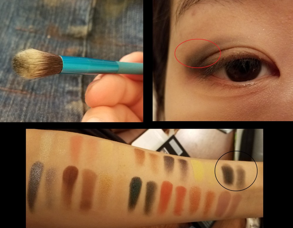
Wear test
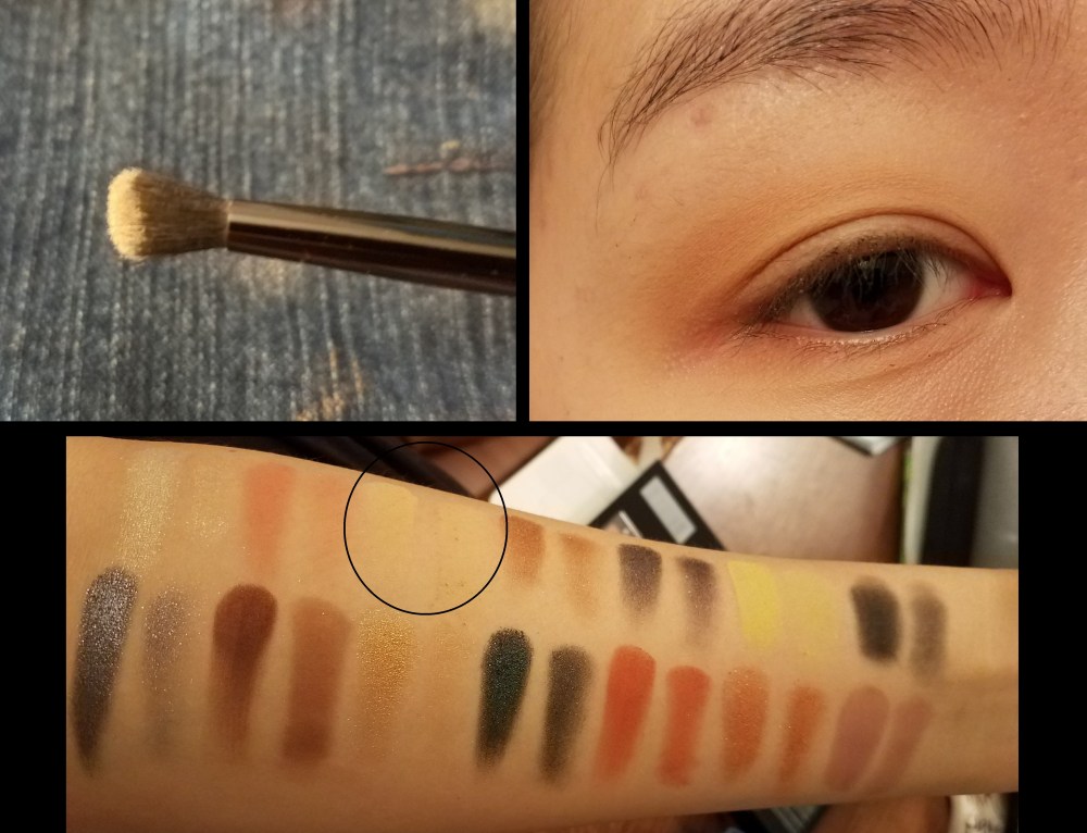
I decided to use the shades Throne and Pyramind on my lids, with parallel and Unity in my crease. You can see that the colors still look in place at the end of the day… but there are little pieces of glitter all around my eyes… I honestly think you can’t tell, but I wouldn’t wear contacts with some of these glitter shades. Some of the other shades did have some creasing, so I would use a good primer if you have oilier lids.
I give the overall wear of the shadows…
Grade: B

Final Thoughts

If the Prism Palette was a student in school it would have a 3.00 GPA. That’s not too bad. Like the average “B” student there are certain topics that are mastered (like most matte shades), and certain topics that need work (like lighter shimmer shades). But Prism has a much higher GPA than Subculture. Subculture is the kid that got terrible grades, but the rich parents tried really hard to keep him in school. Though there are some hits and misses… keep in mind there are no “F”s! I use every color and this color scheme inspires me to try new things with my make up. If you have light-medium skin tone I think this would be a great palette for you! Unfortunately if you have medium-rich skin tone I’m not 100% sure if some of these shades will show up…
What do you think of the ABH Prism Palette?
PSTTT interested in all things eyes? Check out my other posts!


******FULL DISCLOSURE: This are my personal experiences and thoughts. I am not being paid by the brand or the company to review this product or talk about any claims. This product was not sent to me. I have no affiliationor monetary gain at stake for rating this product highly or poorly.*******

I love this analysis of ABH in general and the style of the blog (e.g., history, writing, sense of humor, funny connections to real life). Very good! A+ for you!
LikeLike
Aww thanks MJ! Hope the review was helpful!
LikeLike